 Guys, guess what! Part 2 of ‘Our Rental Kitchen Makeover’ video series is almost here! I know you all have been patiently waiting, thank you! My videographer (aka husband) has been extremely busy the last few months with his non-profit/businesses so we halted production for a bit. But now we’re back and wrapping up part 2 of the video series. I can’t wait to share it with you guys, FRIDAY!
In the meantime, I wanted to give you a closer look at the design plan from the Part 1, and share my plans/ideas in a bit more detail since it’s very hard to cram everything into a 5 minute video. So let’s get to it, shall we?
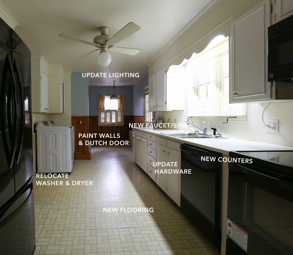
First, lets recap what needs to be done…
The Plan
The Inspiration
Like most, my design process typically starts with finding inspiration on Pinterest. Personally, I love bright, white, modern spaces with a hint of boho/vintage vibes. But because there are some dated features in our kitchen that are not going to be replaced, like the cabinets, I searched for spaces/inspo that had more of a cottage feel. Here’s a few inspo pics…
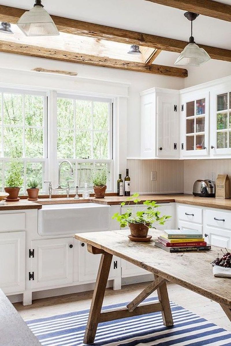
White cabinets/walls and butcher block counters. (source)
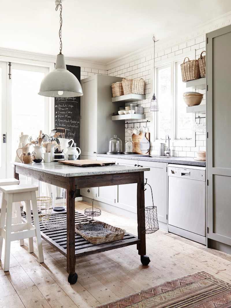
Island cart (with natural stone top) for added counter and storage space is a must! (source)
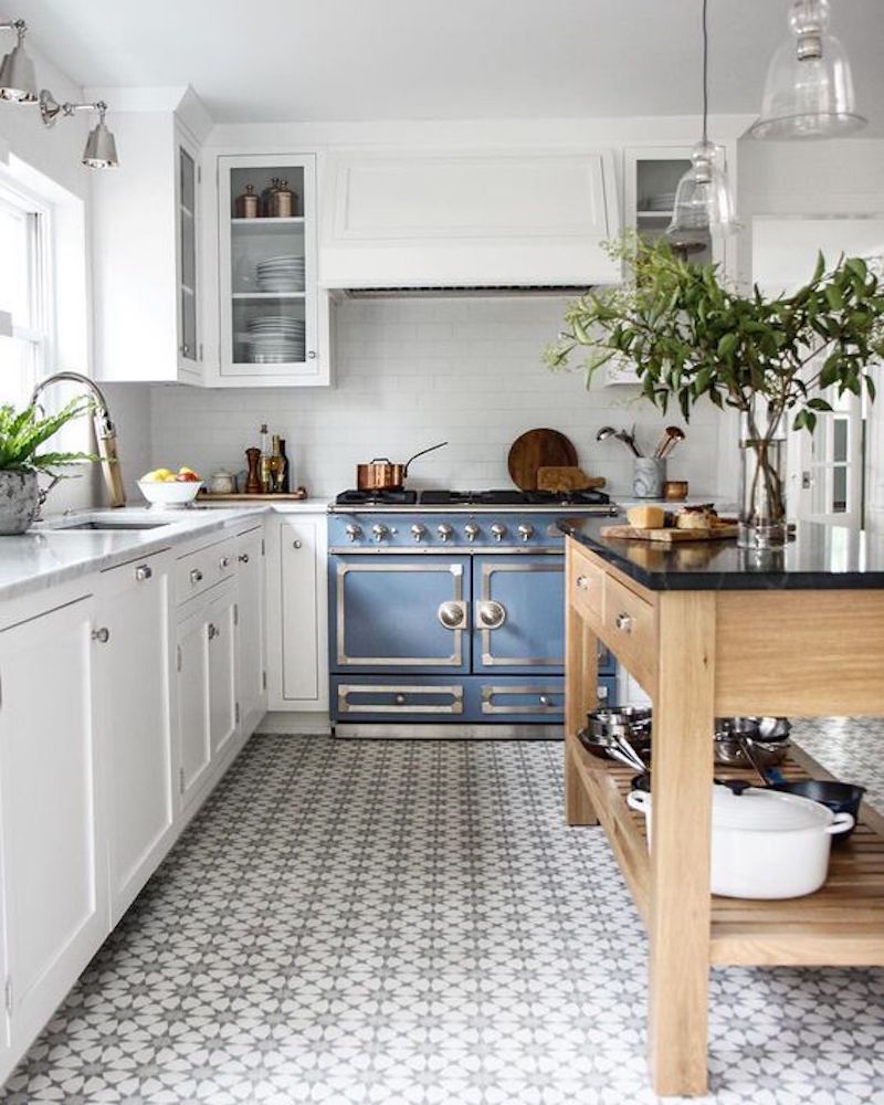 Loving all the character and interest pattern tile gives a space. Side note: that stove, is EVERYTHING! (source)
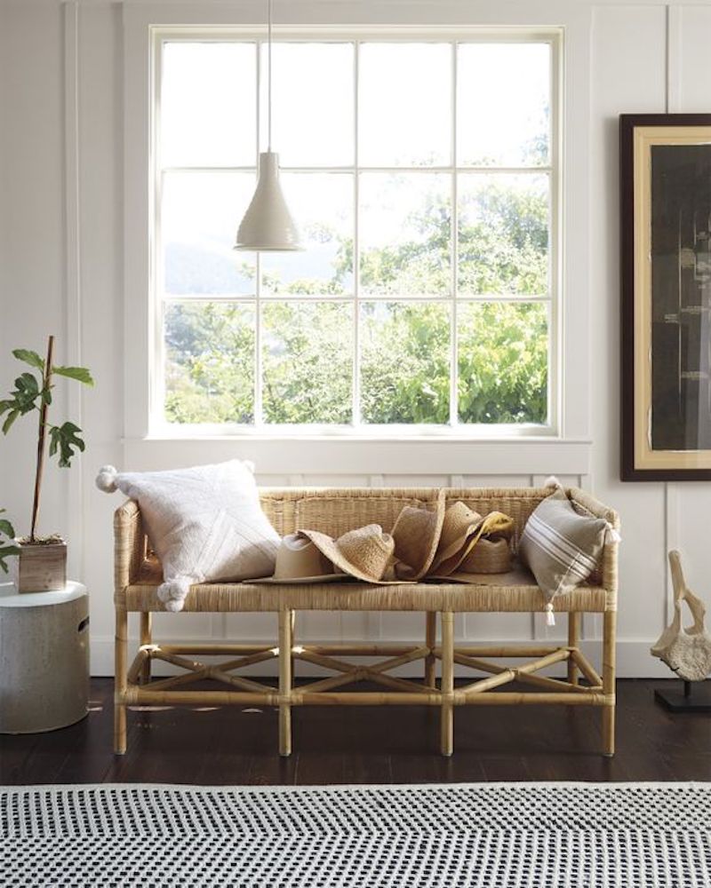 Keeping an all neutral color palette (per usual), and painting the wood paneling white, like this. (source)
The Goals
Throughout the whole design process I had to keep reminding myself, “this is just a RENTAL… you are not designing your dream/ideal kitchen… you are just improving a RENTAL kitchen.” So as much as I wanted to flex my design muscle, I knew I had to be practical, realistic, and smart! So I set some goals to keep my design on track, and made sure all my design choices fell into at least 1 of these 3 categories:
1. Budget Friendly: The landlord has agreed to a reno budget of $1400.
2. DIY Friendly: The installation/process has to be something I can do myself, and won’t take a lot of time.
3. Rental Friendly: Not everyone has a landlord who lets them make permanent changes to their rental, so I want to incorporate products/materials that are temporary or can be easily removed for those of you who may be looking for non-permanent solutions. You’re welcome 😉
The Design
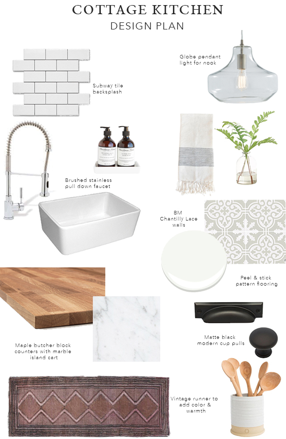
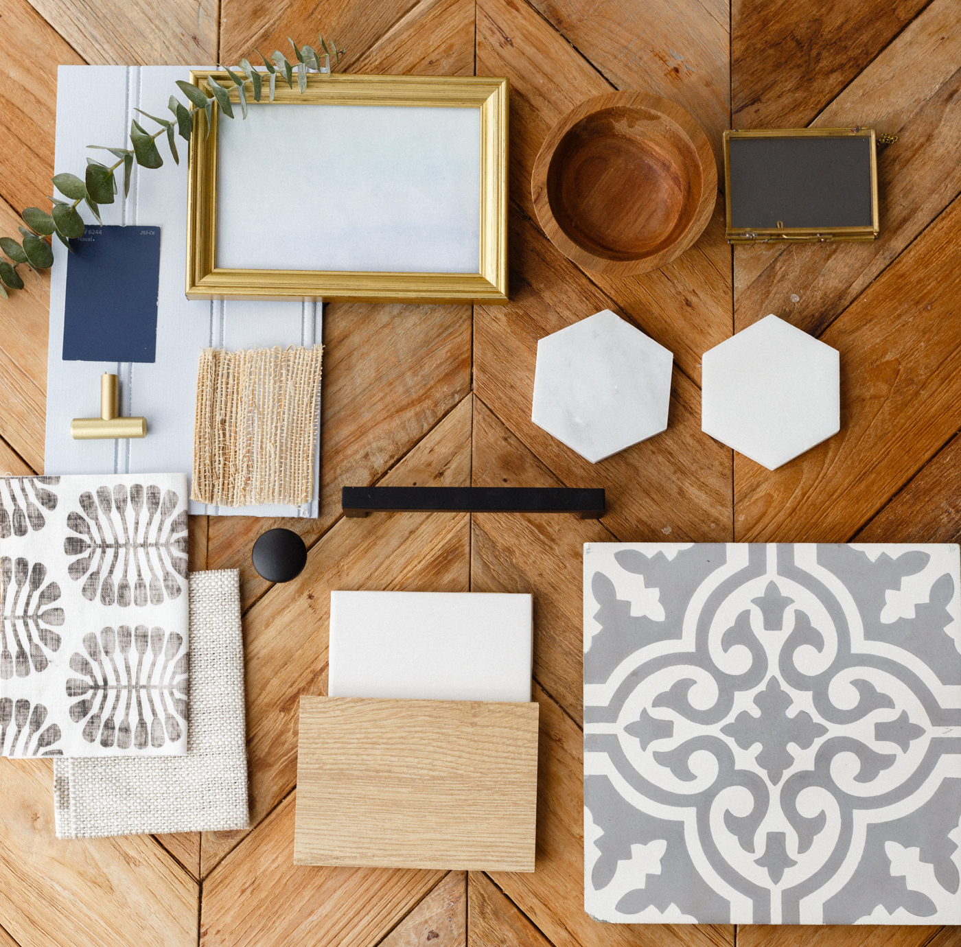
Countertops: When it came to counters, I pretty much had two options based on the budget: laminate, or butcher block. Let me just say, laminate has come a loooong way, folks. I considered these faux marble laminate tops (here), but because I knew the flooring would be ‘faux’ (ie. vinyl), I wanted to incorporate a real/natural material so the whole kitchen wouldn’t just be a whole bunch of ‘faux-ness’. So butcher block it is!
Backsplash: Subway tile was pretty much a no-brainer because of the cost. It’s so cheap! Throughout this whole design process, I had to think like a landlord when it came to selecting materials. Subway tile was the perfect option because if a tile cracks or a repair needs to be made in the future, the landlord can easily find/match replacement tile, for cheap. Plus subway tile is timeless and will never go out of style.
Cabinets: I thought (and am still thinking) about painting the lower cabinets, but I hear it is a very long, tedious and laborsome process — and time is money, people! As of right now, it just wouldn’t be “worth it” for us to put in that much time/sweat equity into this project… but that could change down the road. For now, the cabinets will get a little facelift with new hardware. Matte black cup pulls with a modern silhouette for the drawers, and knobs for the doors, will suffice.
Floors: Now let’s talk about the floors! I received so many comments/questions about the Quadrostyle peel and stick flooring (seen in Part 1 of the video). I think it is the most brilliant thing ever! Now price wise, because the kitchen is a decent size, we needed a large quantity of Quadrostyle flooring, which exceeded our flooring budget. But, I really wanted to showcase a rental friendly product for those who aren’t able to make permanent changes to their space. So I reached out to the company to see if they would be willing to sponsor the flooring, and they agreed! So although the flooring doesn’t necessarily meet my budget-friendly goal, it covers the rental-friendly, and DIY- friendly requirements. When it came to selecting a pattern for the flooring, there were so many options to choose from. But in the end, I went with this pattern, which is a similar pattern to this cement tile I used on the above moodboard. I think it will go perfectly with the vintage/cottage vibe that the kitchen already has.
So that’s the plan! And as I write this post the hubs is busy putting the finishing touches on Part 2 of the video. Can’t wait for you guys to see the transformation! Be sure to follow along on Instagram & Facebook (@eastandlane) for sneak peaks.

Comments
One response to “Our Rental Kitchen Makeover: The Design Plan”
I honestly bealive your plan is brilliant . I love the idea of the Maple butcher counters with marble . I also love how you choose the brushed stainless pull down faucet. Everything else was in my opinion a brilliant choice. I am verry excited and anxious to the end of this master plan.I know it will look amazing☺.