Hey guys! I wrote this blog post on my office makeover on Emily Henderson’s site a few weeks ago, but I also wanted to share it here in case you missed it! Enjoy…
Well, that escalated quickly! It feels like just yesterday I was here introducing my office makeover project and now, here we are just a few weeks away from the final reveal post. In all honesty, I’m not as far along with the progress as I’d hoped, which has kind of been a recurring theme in my life lately (#PandemicProblems). But, I want to give you guys a little update and have you help me with the most important design decision, yet!
First, I just have to say THANK YOU for sharing all your suggestions, tips, and advice on my last post. This was my first time having a huge community of folks weigh in on my design ideas. Initially, I thought having a ton of eyeballs examine my (novice) work with a fine-tooth comb would be nerve-wracking… and it was! BUT, overall I loved hearing all your suggestions and gained so much insight and direction for the design plan. So if it turns out bad, you guys are to blame 😉
I kid…
They say it takes a village to raise a child. Perhaps that’s also true when it comes to design, because the EHD village is definitely helping me “grow up” this office (or as the cool kids say “glow up”)! So needless to say, I’ll be soliciting more of your advice later in this post.
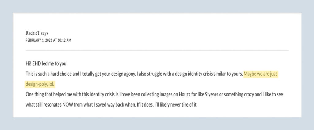
When we last spoke, I was having a bit of a design identity crisis, having newly discovered an interest in more colorful, maximalist design styles, yet being born and raised a neutral, minimalist. Shout out to reader RachieT who diagnosed me as “design-poly”. There is no cure.
Also, another one you made an interesting analysis that the reason I/people may be craving more color in their home is because of quarantine, and prior to the pandemic we would get visual stimuli out in the world, so we wanted our houses to be calm and serene. But now since we’ve been trapped inside (with less stimuli), we crave color.
I’m not sure if that’s been scientifically proven, but it makes complete sense to me and can totally be the cause of my “design-schizophrenia” (diagnosed by reader, Meredith).
Who needs WebMD when you have EHD readers for a consult!
In my quest for answers, I created a bootleg “I Design You Decide” series on my blog, and asked you guys to vote between the two different (yet somewhat similar) mood boards: Organic Coastal Cottage VS Understated Maximalist.
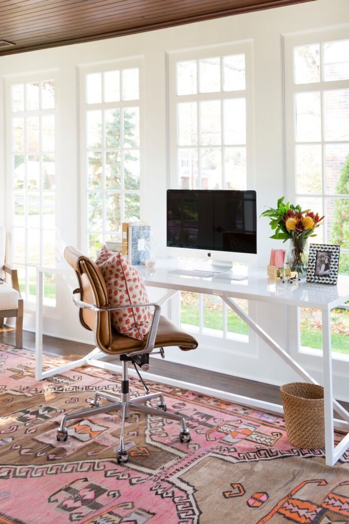
Organic Coastal Cottage resembled my tried and true, neutral, California casual’esque aesthetic that I know, love, and trust. While Understated Maximalist embodied my newfound attraction to color, pattern, and layers of styling.
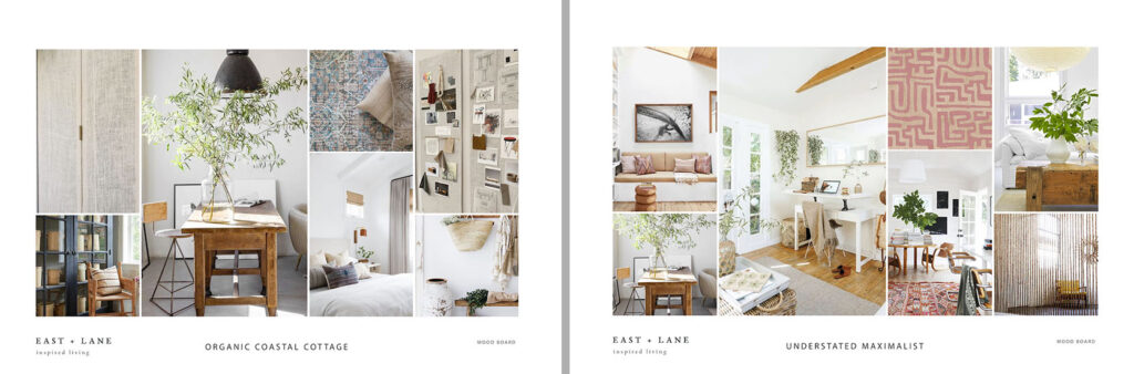
I spent hours (exaggeration) tallying up all your votes. I doubled, tripled, and quadruple-checked my count. And to my surprise, Understated Maximalist won by a landslide!
A lot of you guys mentioned that although Organic Coastal Cottage was “pretty,” it’s a very popular style, which makes it start to feel “generic” and “overdone.” But Understated Maximalist felt more “inviting” and “unique”. Which I completely agree!
I should have left it there and just went with UM, but in attempts to be a star EHD Blog School student, I decided to also do a poll on Instagram (like I’ve seen Em do)… and then I forgot to save the results so I could share it here (rookie blogger mistake). But strangely enough, Organic Coastal Cottage took the lead on IG.
Not sure how/why my Instagram audience votes were polar opposite from my blog audience? Are you guys even on Instagram? Or is everyone on Clubhouse now… (sigh: I can’t keep up)
All that said, what was intended to be a solution to determine a design direction for the space, led me right back to indecision. So in true bipartisan fashion, I decided to combine the two mood boards (as some of you suggested) to create a room that can appeal to both my love of neutral and colorful, generic and unique design.
I hereby introduce you to Understated Organic Coastal Maximalist Cottage!
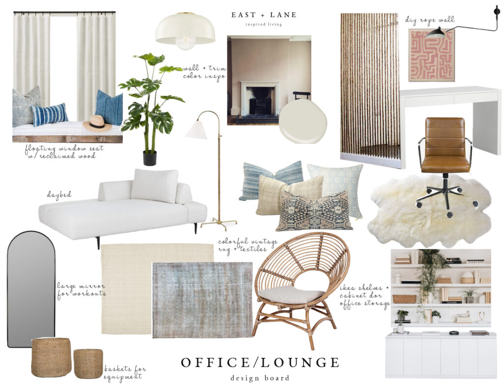
I’m still tweaking, but the plan is to keep the foundational pieces neutral and then add in (bright?) pops of color with textiles and art. I want the space to have a bit of a boho vibe and feel fun and playful (but not juvenile). And of course, no (understated) maximalist space is complete without plants. Lots of plants. Which makes me question if someone with a black thumb, like myself, can even be a maximalist.
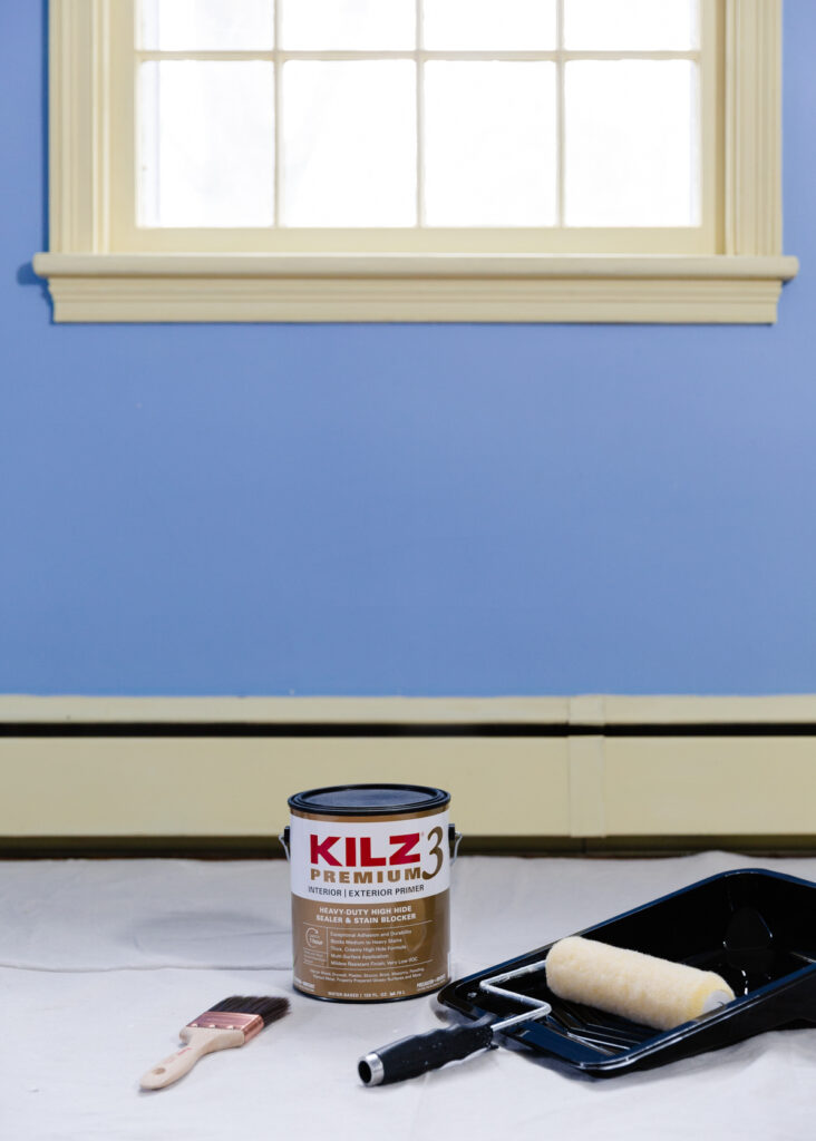
Now for some real-life progress. THE WALLS ARE PRIMED! That may not seem like a big feat for some, but this has been a task I’ve been dreading because 1: all the trim, windows, doors were painted with oil-based paint and 2: blue is notorious for being a hard color to paint over/conceal. But KILZ came to the rescue, yet again!
For those who don’t know (because I surely didn’t until a painter told me), you cannot put latex/water-based paint over oil-based paint without preparing the surface and using a special bonding primer.
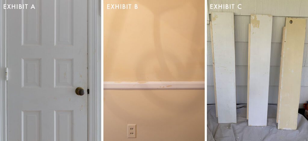
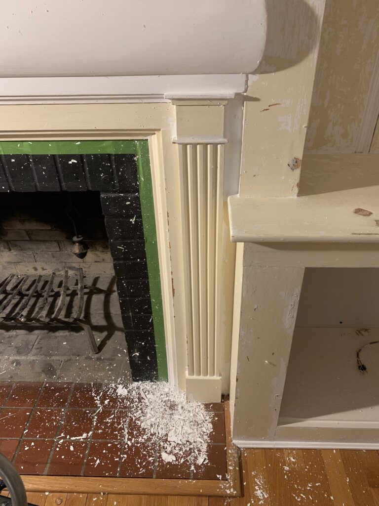
Take a look at exhibit A…and exhibit B… and exhibit C. All areas in my home with peeling paint because the previous painter did not prep the surface and/or use a good bonding primer. I’m also working on making over my living room (and will be revealing that space over on my blog in a few weeks #ShamelessPlug) and had to spend hours scraping peeling paint off the fireplace before I could (re)paint it. ::insert expletives here::
To anyone else dealing with this, I feel you. I’m here for you. And I’m making it my life’s mission to educate as many people as possible on how to properly paint over oil-based paint so no one has to go through what I went through.
But, before I get into the steps you first need to check whether you have oil-based paint on your walls/trim. All you need is rubbing alcohol and a cotton pad or cloth. Rub it on the surface and if the paint does NOT come off, that means it’s oil-based paint (proceed to prep steps below). If the paint does come off that means it’s latex/water-based paint (proceed to enjoy your stress-free paint life).
Disclaimer: I am not a professional painter or paint expert, but I scoured the interwebs and this is what Bob Villa says is the proper way to paint over oil-based paint:
STEP 1: SAND/DE-GLOSS THE SURFACE
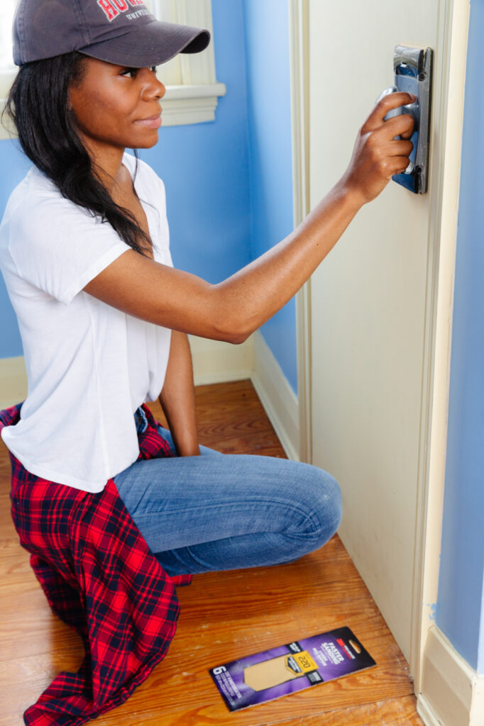
Use 180-220 grit sandpaper and lightly sand down the surface. You’re not seeking to remove all the paint, you just want to rough up the surface some for better adhesion.
Non-expert Key popping in. Ol’ Bob-O didn’t mention this, but if your home was built before 1978, there could be lead-based paint, so be sure to take any necessary precautions before sanding surfaces. Also, fun fact: although I’m not a professional painter, I’m actually Lead-Paint Certified. I used to work for a construction company and it was required for employees to be EPA certified in lead-paint removal.
Okay now back to Bob…
STEP 2: DEEP CLEAN WITH TSP
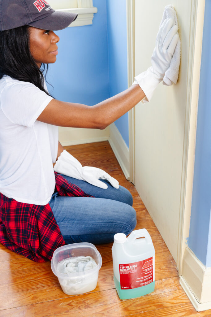
You want to make sure the surface is free from dust, dirt, and grime (all of which reduce adhesion) so wipe down the surface with TSP. Be sure to follow manufacturer’s instructions and safety guidelines.
STEP 3: PRIME WITH A BONDING PRIMER (READ: KILZ 3 PREMIUM PRIMER)
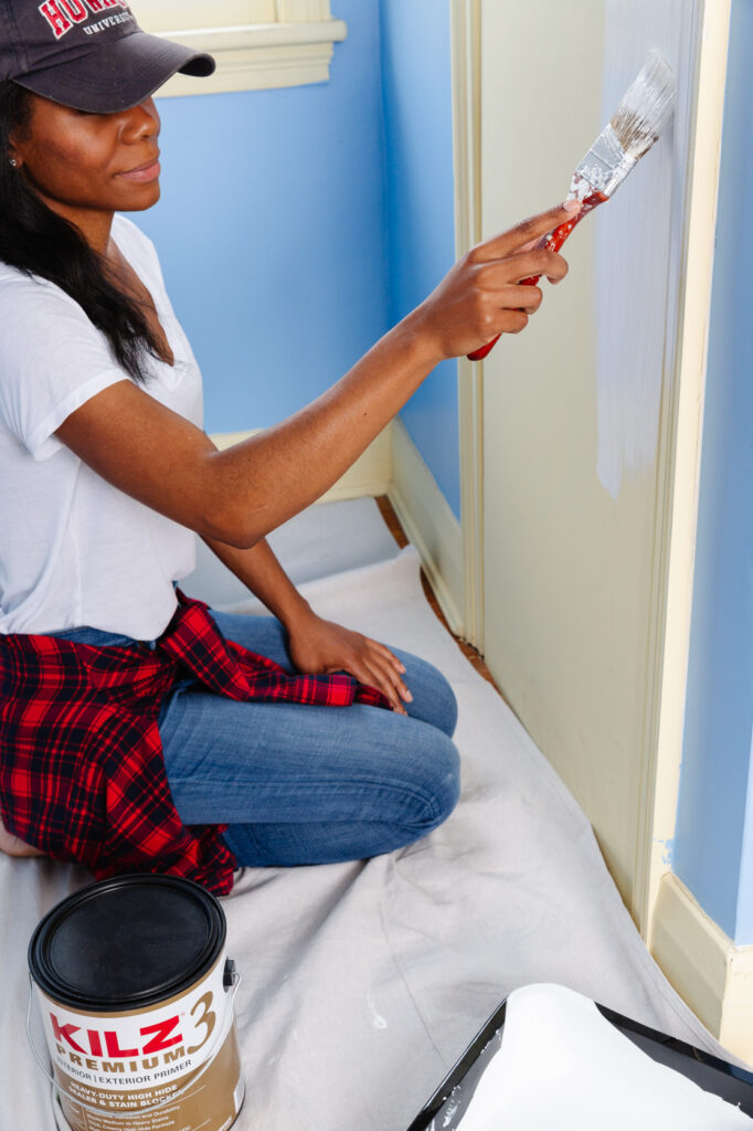
KILZ 3 is specifically formulated to cover all types of paint, which I love. Being able to use the same product on my trim and walls made the whole process so much easier. It also helps adhesion, so my top coat of paint will stick better. I followed these steps when I painted my kitchen bedroom and living room and so far so good, no peeling! I like to use two coats on all the trim to ensure maximum stickage.
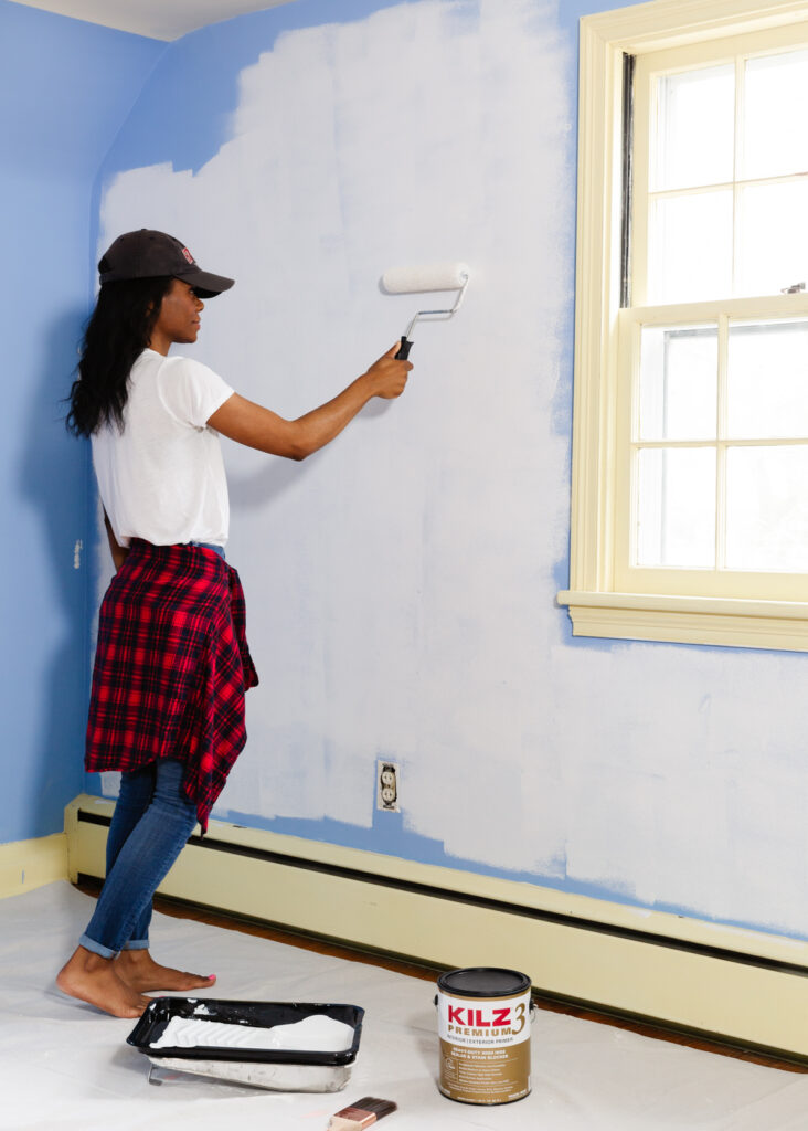
Thankfully, the walls in my office are not oil-based, but boy are they blue! I had already witnessed the “power of primer” on Chandler’s living room reveal, so I felt confident that covering these blue walls would be no battle for KILZ. I obviously also used the same KILZ 3 Premium Primer here and as soon as I poured it into the tray I knew this was a quality product. It wasn’t thin and runny like other primers, but very thick and glided on with ease. And similar to Julie, I was shocked by the coverage of just one coat! It’ll also help my new paint color stick better and it’ll block any medium or heavy stains. Win/win/win.
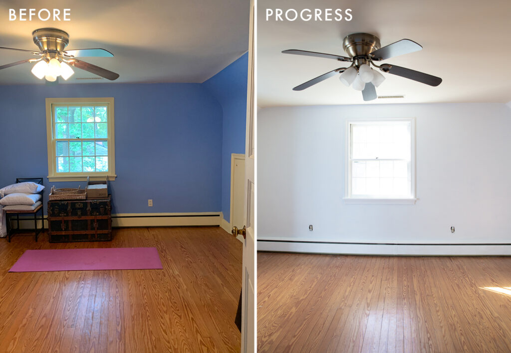
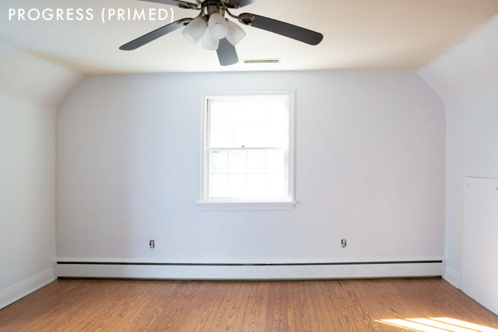
Look how much better the room looks with just primer!
Now that I have a blank canvas to work on, it’s time for me to make my toughest decision, yet. WHAT COLOR DO I PAINT THE WALLS???
There were a few comments/concerns that the room doesn’t get enough natural light to paint the walls white. But contrary to popular belief, the room (and really the whole house) gets a good amount of sunlight. Obviously not as light-filled as some of the inspo photos, but enough to not make white walls look drab and dreary.
Last year, I painted our bedroom (which is adjacent to the office and receives the same amount of natural light) white, and I love how light and airy that room feels. And I just painted my living room white (did I mention that reveal is coming to my blog soon? ;-)). And my kitchen is also white. Although I can’t deny my love of all-white spaces, I think 3 white rooms in one house is enough! Or is it?
Lately, I’ve really been drawn to subtle peach/salmon/blush hues. Even Orlando’s vibrant peachy pink gym gave me heart eyes, although I don’t think I’m ready to clad my walls in that much color, yet.
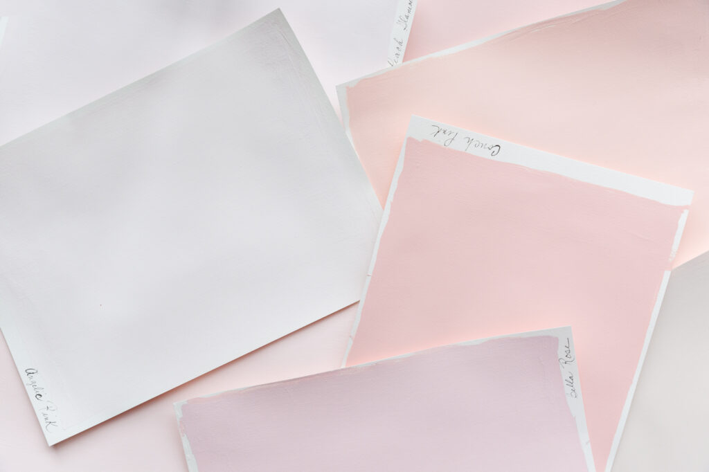
KILZ has some really pretty options in that color family. I got a few samples and made swatches on white paper (in true EHD fashion).
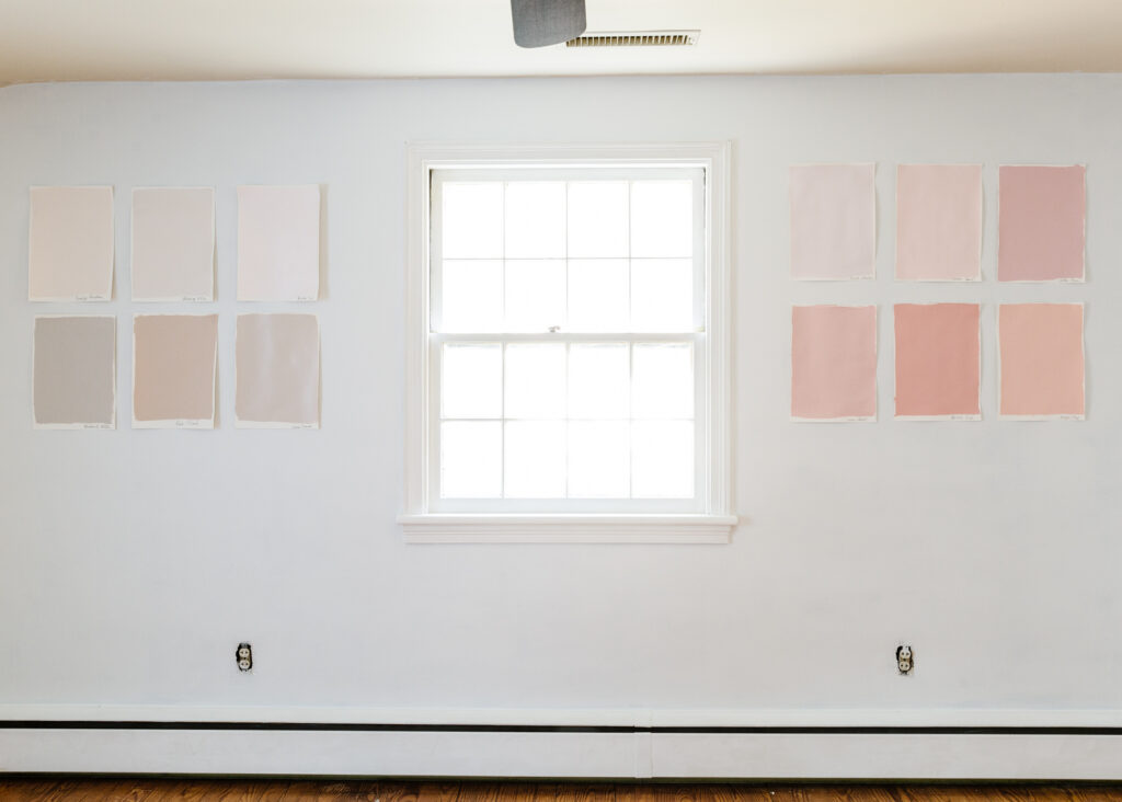
And now I need your help (again)! Initially, the plan was to paint the walls white/off-white and then load in color with art and textiles. But now I’m thinking maybe I should paint the walls one of these pink/ peachy hues.
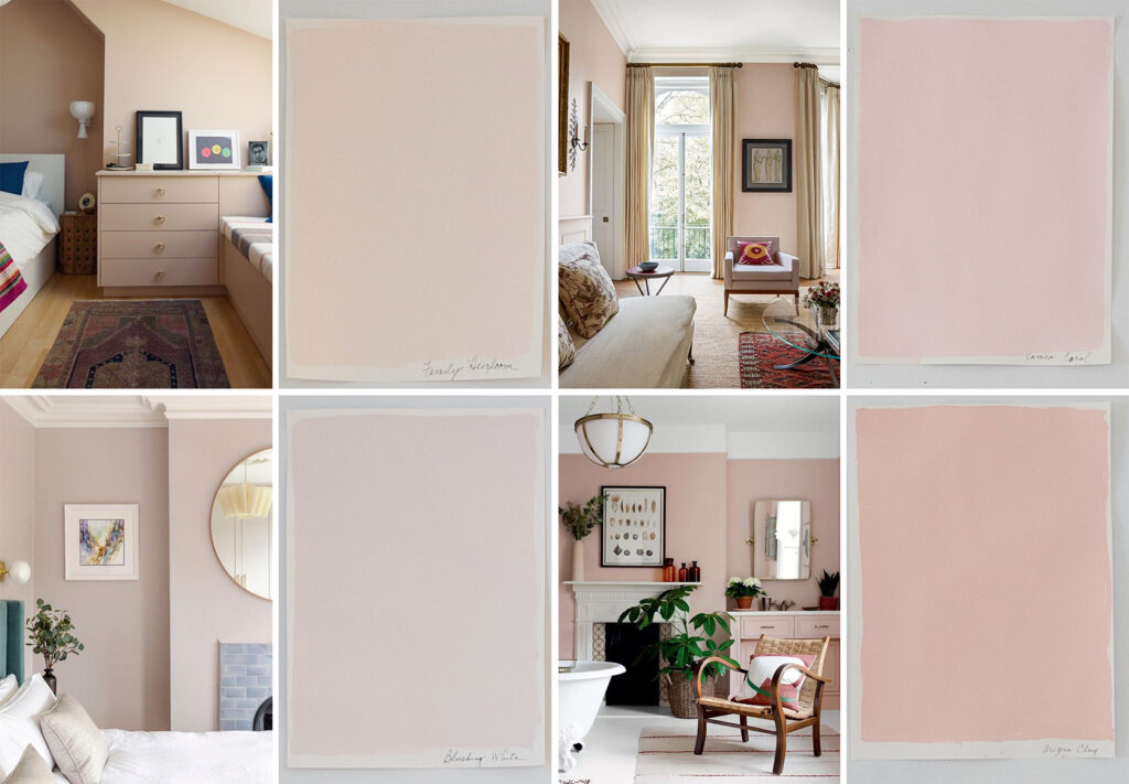
It’s so hard to get the color to read accurately in these early swatch photos, but some of the swatches are a very close match to the above inspo photos that I’m so drawn to! What do you guys think, do I stick with the original plan and just paint the room a shade of white or do I shake things up a bit and go with color? I’ve narrowed it down, and I think these 6 are my front runners.

But would love to know which one of the above colors on the wall speaks to you! Would the swatches on the top left make a nice, neutral base for some bright and maximalist layering? Or should I just dive in with the color? What do you think??? xx